I’m writing this part for people really motivated to delve deeper into the problems with Dr. Deisher’s statistical analysis. In my opinion, Part I would have been far too long, especially for those with little/no exposure to statistics, if I had included it. However, I refuse to behave like some of our critics who essentially tell us, “don’t worry your pretty little heads about trying to understand science; Deisher has a Ph.D.” What a paradox! If we blindly accept the mainstream consensus, we are uneducated, lazy sheep who need to “wake up.” Yet, if we use our intellect (while acknowledging our limitations) to think critically and not blindly accept Deisher’s novel, extraordinary claims, we’re “embarrassing” ourselves. I won’t treat you like that, dear reader. Since I am waiting to hear back from a couple people regarding Part II, if you’re inclined to dig a little deeper, let’s do that.
There are some things I want to make perfectly clear: I chose to operate under many of Deisher’s assumptions that I knew weren’t particularly or necessarily valid because I didn’t need to exit that paradigm to point out the flaws in the rationale. However, there are more reasons to think Deisher’s analysis is flawed from the outset and I’d like to address just a few.
When McDonald and Paul published “Timing of Increased Autistic Disorder Cumulative Incidence” in 2010, referred to as “the EPA study”, the buzz over it came primarily from anti-vaccinationists like David Kirby and Andrew Wakefield and Dr. Deisher’s Sound Choice Pharmaceutical Institute (SCPI). Pro-life activists and writers took SCPI’s newsletter as gospel and sounded the alarm that the EPA “confirmed” what SCPI was saying: WI-38/MRC-5 (fetal cell line) vaccines were implicated in the rise of autism. However, as stated in Part I, McDonald and Paul never found three significant changepoints like Deisher; they found one. Further, McDonald clarified that his paper never said anything about correlations between autism and vaccines.
Our study draws no causal linkages with anything and the recent increase in autistic disorder, and certainly not to the use of fetal tissues in vaccines…. In no case is a correlation with any of these things, including with the timing of the change point, with some other occurrence any indication of causation.
Perhaps the reason that it was those seeking out evidence against vaccines and not the scientific community who made a big deal of this study is that it is seriously questionable whether McDonald and Paul’s analysis was worthwhile to begin with. Was a “hockey stick” analysis of the given data valid? There are many models that can be used to fit all kinds of data, but not all combinations are valid for drawing conclusions. Think about the most basic ways we talk about data. You probably know mean (average), median, mode and that they can yield very different results depending on what data set you are using, and not every result is meaningful. For example, when we talk about average life expectancy, it might not be very meaningful in predicting when people die if you have very high child mortality bringing the average down. Statistics, especially when we’re talking epidemiology, is like that on steroids. It requires an incredible amount of knowledge and judgment such that even professionals will debate the validity of the methods another professional used.
This happens in the case of “the EPA study.”
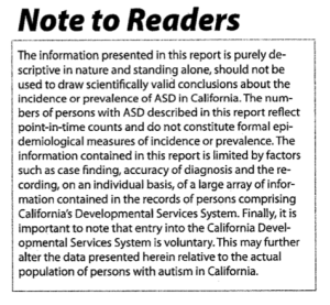
The first problem is whether the data set is even appropriate to be used for analysis. The California Department of Developmental Services states very clearly:
The information presented in this report is purely descriptive in nature and standing alone, should not be used to draw scientifically valid conclusions about the incidence or prevalence of ASD in California. The numbers of persons with ASD described in this report reflect point-in-time counts and do not constitute formal epidemiological measures of incidence or prevalence… Finally, it is important to note that entry into the California Developmental Services System is voluntary. This may further alter the data presented herein relative to the actual population of persons with autism in Califoria.
 Important to note, Deisher’s other primary source, the U.S. Department of Education’s Individuals With Disabilities Education Act (IDEA) database, is also a questionable source for data on autism. It is dependent upon the reporting school districts, which base their assessments on legislation passed by the various states, and mandatory reporting was not required until 1993. As Dr. James Laidler concluded in his 2005 article in Pediatrics, these, along with other “anomalies” within the data “point to internal problems in the USDE data that make them unsuitable for tracking autism prevalence.” Therefore, it is a huge assumption just to say that these data are an appropriate place to look for a changepoint.
For the sake of argument, as I did in Part I, let’s assume that it is. The next problem we encounter is whether McDonald and Paul (and, later, Deisher) were justified in using a changepoint “hockey stick”/segmented line fitting analysis. Matthew Carey, whose criticism of was published by Environmental Science and Technology, the journal that published McDonald’s study, said they were not. He noted in a follow-up post, “One can fit a ‘hockey-stick’ to exponential data but the results are meaningless. There is no change point in an exponential curve.”
[Updated 9/18/14] For those who haven’t cared about equations, lines, or, well, math in general since high school, here’s the briefest of reminders. A straight line is described by the equation y= a + bx, where “y” (the vertical value) will equal “b” (the slope) multiplied by “x “ (the horizontal value) plus “a” (the slope intercept). In other words, the value of any point on the line will have a “y” value that is directly proportional to “x”. Non-linear curves are different. An exponential curve will have the “y” value on the curve directly proportional to “x” as anexponent. A polynomial curve will have the “y” value directly proportional to “x” to the power of one or multiple exponents (x2, x3, etc.)
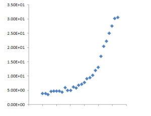
When we look at the data without any lines to make us think a certain way, it clearly appears non-linear.

Mark C. Chu-Carroll, Ph.D. in Computer Science and author of Good Math: A Geek’s Guide to the Beauty of Numbers, Logic, and Computation, noted in the comments section of his analysis of Deisher’s changepoints, which I linked to in Part I, “If you try to apply linear regression to an exponential curve, you’ll get a lousy fit. Virtually any partition will improve it significantly.” Mark Palenik, Ph.D. in Physics, very quickly noted upon reading Deisher’s study (which, recall, is using the same data as “the EPA study”) how it appeared that the
entire argument is based on the fact that the more lines you fit to the data, the better the result is. There is literally no possible way this could not be the case. If you have N points and use N-1 lines, you can connect them all and fit the data perfectly…. Of course you can fit an exponential curve better with 4 lines than 1, but that doesn’t mean that something special happens at the points that you’ve chosen to switch the slope of your line. The slope of a non-linear curve is continually changing at every point, and using more lines simply approximates it better.
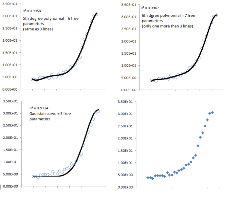
Dr. Palenik graciously provided us with several other models for the California data. To judge how well the line fits the data, we look to the coefficient of determination, R2 supplied on the graphs, which ranges from 0 to 1. An R2 value of 1 means that the line is a perfect fit to the data. As you can see, they are all good fits of the data. But, they’re all different models. You can read Palenik’s full explanation below, but this part is key: “I produced three very good fits to the data, one of which uses the same number of parameters as Deisher’s model and one of which uses half as many. That doesn’t mean they’re all good models. They can’t be because they’re not all compatible with each other.”

“Since Deisher’s analysis used 2 turning points and 3 lines (as you can see in the original figure), that means there are 6 free parameters. A line can be described by the equation y=mx+b where m and b are free parameters (slope and intercept) that can be adjusted. Two parameters for each line can be adjusted and 2×3=6. Alternatively, you can think of it as slope1, intercept1, slope2, turning point1, slope3, turning point2, again, six parameters.
A fifth degree polynomial also has six free parameters, ax5 + bx4 + cx3 + dx2 + ex + f. So what happens if we use a fifth degree polynomial, making the fit line and marker size/shape around the same as it is in Deisher’s paper (eyeballing it)? We get the image in the top left corner of my figure. It fits the data pretty well, doesn’t it? The Pearson’s R2 coefficient tells us how good of a fit we have. 1 is a perfect fit (hits every point exactly) and 0 means it doesn’t fit at all. The R2 value of this graph is 0.9953! That’s really close to 1!
A sixth degree polynomial has seven free parameters, which is only one more, so why don’t we try it? We then get the image in the top right corner, with a Pearson’s R^2 coefficient of 0.9967! Even better! The point is, the more adjustable parameters you have, the easier it is to make your model match the data. But that alone does not mean your model is meaningful.
Let’s try one more thing. The data looks kind of like a Gaussian (another name for a normal distribution). This kind of curve only has 3 adjustable parameters, the height, the offset, and the width. In other words, fitting to a Gaussian is actually more restrictive than fitting to 3 lines… I just estimated the three parameters by doing a few simple calculations and plotted the result. I calculated the Pearson’s R2 coefficient by hand (which is why it may be in a slightly different font on that graph), and it’s 0.9724! Again, really close to 1!”
Based on these facts, it should be obvious why “the EPA study” was predominantly ignored or met with skepticism in the mainstream scientific community. To show just one significant change point, as McDonald and Paul suggest, requires an exceptional amount of work, which they did not appear to do. Chu-Caroll gave some insight as to what that work would look like in his analysis; suffice it to say, finding a changepoint is “extremely tricky.” Therefore, for Deisher to use that same data to claim two genuine change points is not reasonable. Her analysis would require “an extremely robust change at both points, along with showing that non-linear matches aren’t better than the multiple slope changes.” As we’ve seen above, this is just not the case.
There is no rationale cited by Deisher for claiming two change points other than “the segmented algorithm with 2 change points (1980.9 and 1988.4) resulted in a better fit of the data than the hockey-stick method used by the EPA…”. As I stated in Part I and will state again, you just can’t do that. Simply getting a “better fit” than another model, especially a model that might be flawed like McDonald and Paul’s, is completely meaningless. Even the best “fit” for the data could be a poor description of the relationship, if any exists, between the two variables. “Simply claiming that producing better fits is what we strive to do is completely wrong,” concurs Palenik.
Statistics is tricky. Software is only as good as the operator behind it. It takes a lot of work and a knowledge of statistics to be able to validly analyze data. I hope this clarifies and reinforces how this did not happen in Deisher’s study and why we should not consider her change points meaningful in any way.
See the other posts on this study [updated 9/23/14]:
– Abortion, Autism and Immunization: The Danger of the Plausible Sounding Lie
– Problems with Deisher’s Study— Part I: The numbers
– Problems with Deisher’s study— Part II: Biological Implausibility

Hi–to date, yesterday I have left two comments at this site on posts related to this subject. They were charitable but perhaps challenging comments–they are apparently still in “awaiting moderation” mode.
Do you anticipate “approving” these comments so as to facilitate actual/real dialogue on the various aspects of this topic? I would certainly hope that you would be willing to do so. If not, would you please contact me privately with some explanation? Thanks for considering…
LikeLike
Hi Jim,
We are still getting our feet in terms of this blog. We are about 3 weeks old at this point and are still ironing out kinks regarding blog comment moderation and discussion. I am probably the worst offender when it comes to going through the comments and approving them, so my apologies for that. Thanks for your patience while we figure out the best way to facilitate dialogue.
LikeLike
Sounds good–thanks! JR
LikeLike
[…] Stay tuned for Part III: Study design and Conclusions See the previous posts on this study: – Abortion, Autism and Immunization: The Danger of the Plausible Sounding Lie – Problems with Deisher’s study— Part I: The numbers – Looking a little closer at the numbers— A supplement to Part I […]
LikeLike
[…] 9/23/14]: – Abortion, Autism and Immunization: The Danger of the Plausible Sounding Lie – Looking a little closer at the numbers— A supplement to Part I – Problems with Deisher’s study— Part II: Biological […]
LikeLike
[…] study [updated 9/23/14]: – Problems with Deisher’s Study— Part I: The numbers – Looking a little closer at the numbers— A supplement to Part I – Problems with Deisher’s study— Part II: Biological […]
LikeLike
[…] Her theory is not plausible with what we understand about autism, her statistical analysis does not hold up to scrutiny, and her hypothesis is biologically implausible. We do not deny Dr. Deisher’s expertise in […]
LikeLike